The Dividend Kings That Are Also Cash Cows
Two filters most investors run separately. Stack them, and only a handful of JSE names survive both. The overlap is where quality hides.
Why stack two filters instead of one?
Most screens give you a single lens. Run a dividend-consistency filter and you get reliable payers. Run a free-cash-flow filter and you get cash generators. Each list looks convincing on its own, and each one hides a different kind of trouble.
A long dividend streak can be maintained out of stubbornness: management borrowing to defend a record the business no longer supports. A fat cash-flow yield can be an accident: one good year, an asset sale, a cyclical peak dressed up as a habit. Run either filter alone and these impostors sit in your results looking exactly like the real thing.
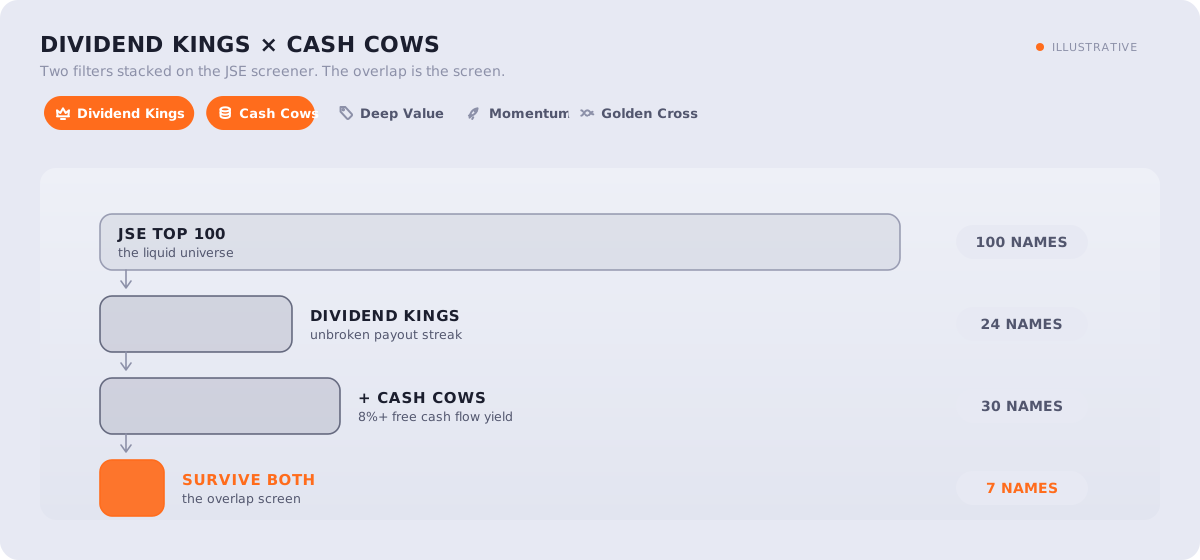
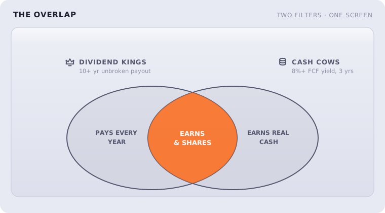
The fix is not a better filter. It is a second, unrelated one. The TradeIntel screener lets you stack filters, so this recipe sets two: Dividend Kings and Cash Cows. The first proves discipline over a decade or more. The second proves the dividend is funded by the business, not by debt. The names that clear both are describing something rarer than either list alone: a company that both earns and shares, year after year.
Filter one: what qualifies as a Dividend King?
What it requires: a dividend paid every year for at least 10 years on the JSE (25 years in the US), never cut by more than half in a single year. A deeper cut ends the streak and the stock drops off the list.
A dividend record is the hardest number in the accounts to fake. Earnings can be massaged with accruals and timing; a cash payment to shareholders either happened or it did not. Boards know a cut gets punished, so an unbroken streak encodes years of management choosing to protect the payout through load-shedding, rand swings, and at least one full cycle. That is information no single year's ratio can give you.
The pattern is documented well beyond the JSE. Ned Davis Research, in work popularised by Hartford Funds, found that from 1973 to 2023 US companies that grew or initiated dividends outperformed non-payers, and did it with lower volatility. The reliability is the point, not the size of the yield. A 10-year JSE streak is a high bar locally; the US bar sits at 25 years because a 10-year streak is too common among S&P 500 names to carry information there.
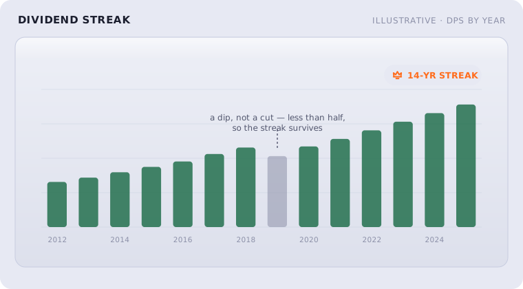
But a streak is a rear-view mirror. It tells you what management did, not what the balance sheet can still afford. Companies have paid proudly for twenty years and then cut in year twenty-one. That is the failure mode this filter cannot see, and exactly the one the second filter exists to catch.
Filter two: what does the Cash Cows filter require?
What it requires: a free cash flow yield of 8% or more, with positive free cash flow in each of the last three years.
Free cash flow is what remains after the company has paid for everything needed to keep itself running and growing. It is the money that actually funds a dividend. Dividing it by the market value gives a yield: an 8% floor means the business throws off real cash equal to at least 8% of its price, every year, which is a genuinely demanding bar. The three-consecutive-years condition stops a single flattering year from sneaking through.
The reason to prefer cash flow over earnings is the same reason to prefer dividends over promises: it is hard to fake. The academic quality-and-profitability literature (Novy-Marx's 2013 work on gross profitability, Asness, Frazzini and Pedersen's "Quality Minus Junk") keeps finding the same thing: measures of real cash generation describe future returns better than reported earnings alone.
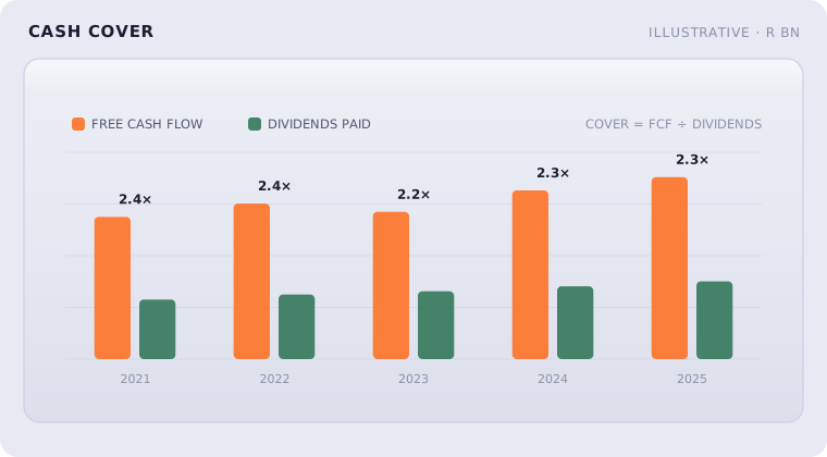
Put differently: a dividend you can trust is one the cash flow can pay twice over. When cover is 2× or better, a bad year dents the cushion instead of the payout. When cover drifts toward 1×, the streak is living on borrowed time, sometimes literally.
How do you build this screen?
The recipe takes under a minute in the screener.
Step one. Open the stock screener and pick your market. The filters run on both the JSE and US universes, with thresholds calibrated per market.
Step two. Switch on Dividend Kings. The list collapses to the long-streak payers.
Step three. Switch on Cash Cows. Most of the payers drop out. What remains is the overlap.
Each survivor carries a strength score on both filters, so the list ranks itself: a 25-year streak backed by a 12% cash yield sits above a 10-year streak scraping the 8% floor. The table below shows the kind of output the overlap produces. It is illustrative, not a recommendation.
| Name | Dividend streak | FCF yield | Read |
|---|---|---|---|
| Example A | 14 yrs | 11.3% | Funded comfortably |
| Example B | 11 yrs | 9.6% | Funded comfortably |
| Example C | 10 yrs | 8.1% | Watch, scrapes the floor |
How should you read the results?
The screen ends where the judgment begins. A name that clears both bars with room to spare is a different proposition from one that scrapes past both, even though the screener shows a tick either way. That is what the strength scores are for. The streak tells you about the past; the cash cover tells you whether the past can continue.
The thresholds are also yours to bend. Tighten the cash-yield floor and the list shrinks to the sturdiest handful. Loosen it and you trade quality for breadth. There is no right setting, only knowing which trade-off you made.
Where does this screen mislead?
Every filter has a blind spot, and stacking two shrinks the blind spot without removing it.
Both filters look backward. A pristine streak and three years of cash generation describe the company that was. A structural break (a new competitor, a regulatory shift) resets everything, and no historical screen sees it coming.
Free cash flow is lumpy. A company in a heavy investment year can show weak cash flow while building real value, so the screen can drop good businesses in their spending years. The reverse also holds: starving a business of investment flatters cash flow for a while.
Banks and insurers read differently. Their cash flow and leverage mean different things, which is why financial statements-based filters treat them separately across the platform.
The overlap list is a shortlist of candidates that have earned a closer look, not a conclusion. The reading of annual reports is still yours to do.