The 10 Filters, Explained: The Research and Metrics Behind the Screener
Every screen we run is a published market anomaly turned into a hard rule. Here is the metric, the threshold, and the research behind all ten.
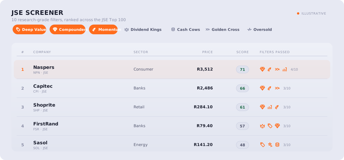
Why use filters instead of opinions?
A stock screen is a question you ask the whole market at once. Instead of arguing about whether a company is cheap, you define cheap as a number, point it at every name in the universe, and read back the list that qualifies.
That sounds mechanical, and it is. The point of being mechanical is that it removes the part of investing that hurts most retail investors: the story. A good narrative will talk you into a bad price every time. A filter does not care about the story. It checks the number and moves on.
The ten filters in the TradeIntel screener are not arbitrary. Each one is a rule-based version of a market pattern that academics and practitioners have documented, in many cases for fifty years or more. Value, momentum, quality, profitability, and trend are among the most heavily studied effects in finance. We did not discover them. We turned each into a precise, testable condition and ran it across the JSE Top 100 and the US large-cap universe.
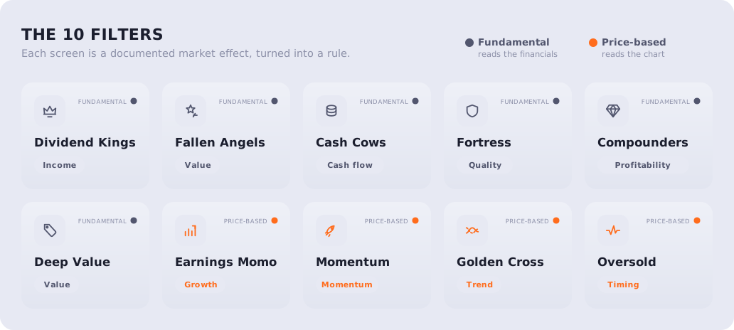
This article walks through all ten: what each one measures, the exact threshold we use, the research behind it, and where it can mislead you. Read it once and the screener stops being a black box.
A note before we start. Two of the thresholds change depending on the market, because the JSE and the S&P 500 are not the same animal. The US large-cap universe trades at a much higher median valuation than the JSE, so a "cheap" cutoff that catches a quarter of JSE names would catch almost nothing in the US. Where a number is calibrated per market, we flag it.
How is each filter scored?
Each filter returns two things for every stock: a pass or fail, and a strength score from 0 to 100. The pass tells you whether the stock clears the bar. The score tells you by how much. A company scraping past the dividend threshold with an 11-year streak scores far lower than one with a 40-year record, even though both "pass."
When a stock passes several filters, we average the strength scores of the filters it passed into a single composite. A name that passes three filters strongly will rank above one that passes four filters weakly. That composite is what drives the screener's default ranking.
The universe itself is filtered first. A stock has to be liquid enough to actually trade (a minimum average daily value traded, set per market) and have at least roughly a year of price history before any filter touches it. Illiquid microcaps and recent listings are dropped before scoring.
What are the six fundamental filters?
These six read the financial statements: dividends, cash flow, debt, returns, and valuation. They answer the question "is this a good business at a fair price."
1. Dividend Kings
What it measures: A company that has paid a dividend every year for at least 10 years on the JSE (25 years in the US), and never cut it by more than half in a single year.
The research: Dividends are the most honest signal a company sends. A board can massage earnings, but it cannot fake a cash payment to shareholders, and it is extremely reluctant to cut one. Long, unbroken dividend records are therefore a proxy for durable cash flow and disciplined management. Ned Davis Research, in work popularised by Hartford Funds, found that over 1973 to 2023 the companies that grew or initiated dividends delivered higher returns than non-payers, and did so with lower volatility. The reliability is the point, not a high yield.
The threshold and why: We require an unbroken streak, and a cut deeper than 50% in any year ends the streak. The streak length feeds the strength score, scaled so that a 25-year record scores full marks. The US bar is set at 25 years deliberately: a 10-year streak is so common among S&P 500 names that it carries no information there, so we hold US names to the genuine "dividend kings and aristocrats" standard.
Where it misleads: A long streak is a backward-looking measure. A company can have paid for thirty years and still be one bad cycle from a cut. The filter rewards history, not the future, so pair it with a balance-sheet or cash-flow check.
2. Fallen Angels
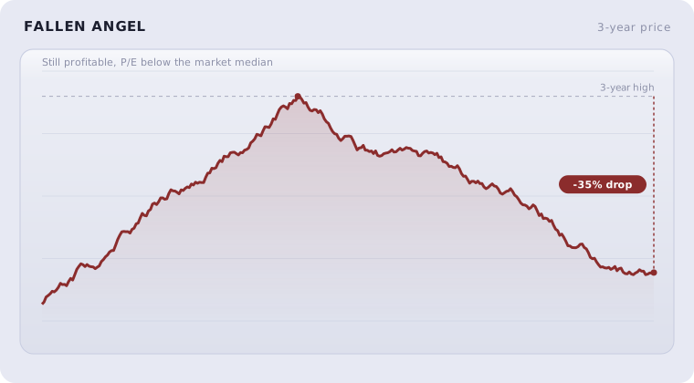
What it measures: A profitable company trading at least 30% below its three-year high, at a price-to-earnings ratio below the universe median.
The research: This is a contrarian, mean-reversion screen. The foundational work is De Bondt and Thaler's 1985 paper "Does the Stock Market Overreact?", which showed that stocks beaten down hardest over the prior three to five years tended to outperform the prior winners over the following years. Markets overshoot on bad news. The trick is separating a temporary punishment from a permanent decline, which is why this filter insists the company still be profitable and still be cheap relative to its peers, not just down.
The threshold and why: The 30% drawdown is measured from the highest close in the last three years. The P/E condition compares the stock to the median P/E of the screened universe, so "cheap" is defined relative to the current market, not an absolute number. A deeper drawdown scores higher, on the logic that a larger overreaction leaves more room to recover.
Where it misleads: Some stocks are down 30% because the business is genuinely broken. The profitability and valuation conditions filter out the worst of these, but no screen can tell a falling knife from a bargain with certainty. Treat the list as candidates for research, not conclusions.
3. Cash Cows
What it measures: A free cash flow yield of 8% or more, with positive free cash flow in each of the last three years.
The research: Free cash flow is what is left after a company pays for everything it needs to keep running and growing. It is the cash available to fund dividends, buy back shares, or pay down debt. Free cash flow yield (free cash flow divided by market value) is a valuation measure that is much harder to manipulate than earnings, because accounting earnings include non-cash items and timing choices that cash flow does not. The broader academic case sits inside the profitability and quality literature, where measures of real cash generation have been shown to predict returns better than reported earnings alone.
The threshold and why: An 8% free cash flow yield is a high bar; it means the business throws off real cash equal to at least 8% of its price every year. We also require three consecutive years of positive free cash flow so the screen is not fooled by a single strong year. The strength score scales up to a 20% yield, so the genuine gushers stand out.
Where it misleads: Free cash flow is lumpy. A company in a heavy investment year can show low or negative free cash flow while building real value, and a company starving itself of investment can flatter its cash flow short term. The three-year condition smooths this but does not eliminate it.
4. Fortress
What it measures: Net debt below 1.5 times EBITDA, or no net debt at all. Not applied to banks and insurers.
The research: Debt turns a normal downturn into a crisis. A company with little or no net debt has options in a recession; a heavily indebted one has obligations. This sits inside the "quality" factor, most cleanly defined by Asness, Frazzini, and Pedersen in their 2019 paper "Quality Minus Junk", which showed that safe, profitable, low-leverage companies earn higher risk-adjusted returns over time. Low leverage is one of the safety components of that quality premium.
The threshold and why: Net debt is total debt minus cash. Dividing by EBITDA (a rough proxy for annual cash earnings) tells you how many years of earnings it would take to clear the debt. Under 1.5 years is conservative. A company with net cash, more cash than debt, scores full marks automatically. We exclude banks and insurers entirely, because leverage is the raw material of their business model and the same ratio means something completely different for them.
Where it misleads: EBITDA is a flawed proxy for cash earnings (it ignores interest, tax, and the cost of maintaining assets). The ratio is a screen, not a credit analysis. A low number is reassuring but not a guarantee of safety.
5. Compounders
What it measures: Return on equity above 15% in each of the last three years, with stable or expanding margins.
The research: A company that consistently earns a high return on the capital shareholders have entrusted to it, and can reinvest at that rate, compounds value quietly and powerfully over time. This is the profitability factor, which Fama and French formally added to their asset pricing model in 2015 (the "robust minus weak" factor) and which Robert Novy-Marx documented in his 2013 work on gross profitability. High, persistent profitability predicts higher future returns. The word that matters in our screen is "each": we want consistency, not a single good year.
The threshold and why: We require return on equity above 15% in all three of the most recent years, and we check that operating margins have not deteriorated over that span. Requiring it every year filters out one-off spikes and businesses whose returns are eroding. The strength score scales up to a 30% average return on equity.
Where it misleads: Return on equity can be inflated by debt, since heavy borrowing shrinks the equity base. That is one reason we run it alongside the Fortress filter rather than alone. A high return on equity built on a mountain of debt is not the quality you are looking for.
6. Deep Value
What it measures: A price-to-earnings ratio below 10 (below 15 in the US) and a price-to-book ratio below 1.5 (below 3.0 in the US, with tighter limits for financials), with positive earnings.
The research: This is the classic value screen, and value is among the most documented effects in all of finance. Benjamin Graham built his framework around buying companies for less than their assets and earnings justify. Basu's 1977 study found low-P/E stocks outperformed high-P/E stocks. Fama and French made the book-to-market ratio (the inverse of price-to-book) a cornerstone of their 1992 and 1993 work, defining the value premium that the whole industry now calls HML. Cheap stocks have, on average and over long periods, beaten expensive ones.
The threshold and why: Price-to-earnings below 10 and price-to-book below 1.5 is genuinely demanding on the JSE; this combination fires on roughly a quarter of the local universe. The same absolute cutoffs in the US large-cap market would fire on almost nothing, because US large caps trade far richer, so we relax the cutoffs to P/E below 15 and price-to-book below 3.0 there. Financials, which carry assets very differently, get tighter book-value limits. Both conditions must hold, and earnings must be positive, so a company is cheap on assets and on profits at the same time.
Where it misleads: Value's great enemy is the value trap, a stock that is cheap because it deserves to be and gets cheaper. Value also goes through long stretches of underperformance; the premium is real over decades but not reliable year to year. Cheapness is a reason to look, not a reason to buy.
What are the four price-based filters?
These four read the price chart rather than the financial statements. They measure growth, trend, and timing. They answer a different question: not "is this a good business" but "is the market already moving in its favour."
7. Earnings Momentum
What it measures: Latest annual earnings grew more than 15%, with revenue also growing.
The research: Earnings growth is the most durable driver of share prices over the long run, and there is a well-documented tendency for it to persist in the short run. The relevant academic finding is post-earnings-announcement drift, first noted by Ball and Brown in 1968 and formalised by Bernard and Thomas in 1989: stocks that report strong earnings keep outperforming for weeks and months afterwards, as the market digests the news slowly rather than all at once. Requiring revenue growth alongside earnings growth guards against profit gains that come only from cost-cutting, which cannot continue forever.
The threshold and why: We require earnings growth above 15% and any positive revenue growth. The pairing matters: earnings up but revenue flat or falling is a warning sign that the growth is being engineered rather than earned. The strength score scales up to 50% earnings growth.
Where it misleads: Annual growth figures can be distorted by a weak base year or one-off items. A company recovering from a bad year can post huge growth that says little about its trajectory. Read the growth in context.
8. Momentum
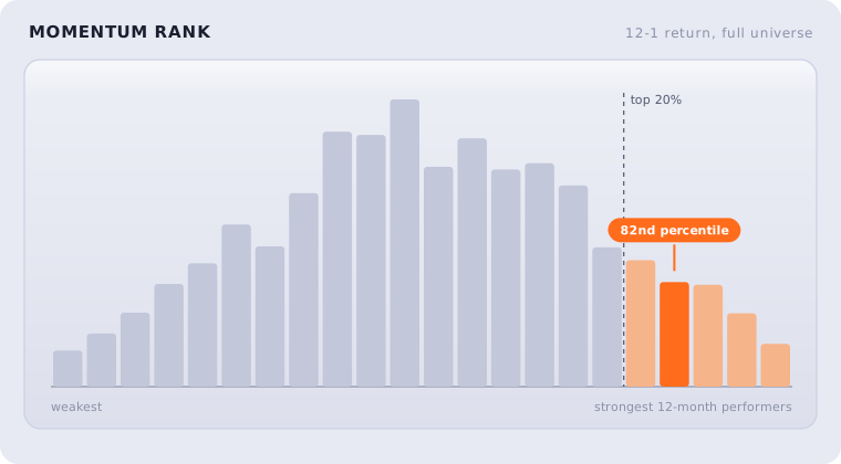
What it measures: A stock in the top 20% of the universe by its 12-month return excluding the most recent month, trading above its 200-day moving average.
The research: Momentum is, alongside value, one of the two most robust anomalies in finance. The landmark study is Jegadeesh and Titman's 1993 paper showing that stocks that performed best over the prior 3 to 12 months continued to outperform over the following months. Asness, Moskowitz, and Pedersen later showed the effect holds across nearly every market and asset class in their 2013 work "Value and Momentum Everywhere". We exclude the most recent month deliberately, because over very short horizons stocks tend to reverse rather than continue (a separate effect documented by Jegadeesh in 1990), and skipping the last month avoids contaminating the signal with that reversal.
The threshold and why: We rank every stock in the universe by its 12-month-minus-1-month return and take the top quintile. We also require the price to be above its 200-day average, so the filter only flags strength that sits inside an established uptrend. The strength score is simply the stock's percentile rank, so the very strongest names rise to the top.
Where it misleads: Momentum works until it does not, and when it breaks it can break hard. The same names that lead on the way up tend to fall fastest in a sharp reversal. Momentum is a trend-following signal, which means it is always a step behind the turn.
9. Golden Cross
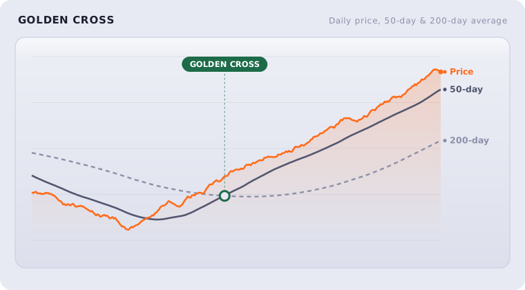
What it measures: The 50-day moving average above the 200-day moving average, with the price above the 50-day. More recent crosses score higher.
The research: This is the most well-known trend-confirmation signal in technical analysis. When the shorter average crosses above the longer one, the medium-term trend has, on the evidence of price alone, turned up. The honest framing matters here: the specific golden-cross rule is more a practitioner heuristic than a settled academic result, and studies of it are mixed. What does have solid support is the broader idea of trend following and time-series momentum, documented by Moskowitz, Ooi, and Pedersen in 2012, and the use of the 200-day average as a trend filter, explored by Faber in 2007. The golden cross is a simple, transparent way to encode "the trend is up."
The threshold and why: We require the 50-day average above the 200-day average and the price above the 50-day, so all three line up. A cross that happened recently scores higher than one that happened a long time ago, because fresh trend changes carry more information than stale ones. We only count crosses within roughly the last two months as "recent."
Where it misleads: Moving-average crosses are lagging by construction; they confirm a trend that has already begun, and they whipsaw badly in sideways markets, flashing a cross and then reversing. The golden cross is best read as confirmation alongside other signals, not as a trigger on its own.
10. Oversold
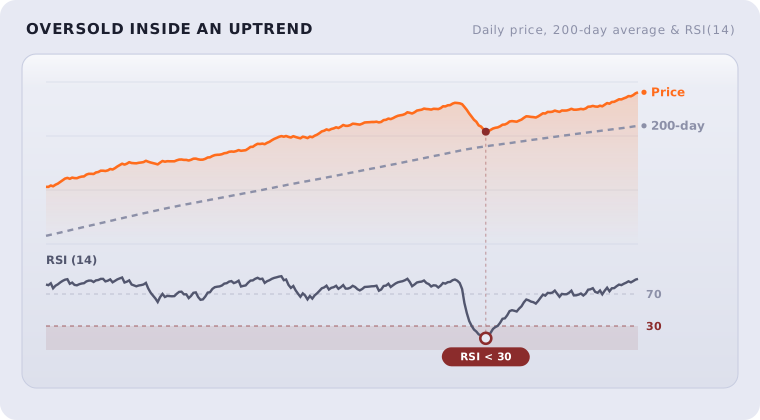
What it measures: A 14-day RSI below 30 while the price is still above its 200-day moving average.
The research: RSI, the relative strength index, was created by Welles Wilder in 1978 and measures how stretched a recent move has become; a reading below 30 is the traditional "oversold" mark. On its own, RSI is a practitioner tool with mixed standalone evidence. The academic backbone here is short-term reversal: Jegadeesh in 1990 and Lehmann in 1990 both documented that stocks that fall sharply over short windows tend to bounce. The condition doing the work in our screen is the 200-day filter. We only flag a stock as oversold if it is having a sharp dip inside an intact uptrend, not while it is in free fall. That combination, a short-term washout within a long-term advance, is historically a more favourable entry than either signal alone.
The threshold and why: RSI below 30 marks the dip; the price being above the 200-day average confirms the larger trend is still up. The further below 30 the RSI sits, the higher the strength score, on the logic that a deeper washout inside an uptrend is a sharper snap-back candidate.
Where it misleads: "Oversold" is not a floor. A stock can stay oversold, and keep falling, for a long time, which is exactly why we will not flag it without the 200-day trend confirmation. Even then, a strong enough downturn will take the trend out from under it.
How do the 10 filters work together?
No single filter is a buy signal. Each one isolates a single, well-studied edge, and each one has a documented way of being wrong. The screener's real value is in the overlap.
A stock that passes one filter is interesting. A stock that passes several, and passes them strongly, is interesting for several independent reasons at once: it might be cheap and profitable and in an uptrend, three different effects pointing the same way. That is what the composite score captures, and it is why the most useful screens combine filters rather than rely on one. The value and quality screens tell you what to own; the momentum and trend screens help with when. Run together, they cover each other's blind spots: value's trap risk against momentum's confirmation, momentum's reversal risk against a fortress balance sheet.
The data behind all of this is refreshed regularly from public market sources, recomputed across the full JSE and US universes, and exposed in the screener so you can see, for any stock, exactly which filters it passed, by how much, and the underlying numbers that put it there. Nothing is hidden behind a proprietary score you cannot inspect.
These filters are educational tools for finding candidates to research. They are not personalised advice, and they are not predictions. Every effect described here is a long-run, on-average tendency drawn from published research; none of them works on every stock or in every period, and past performance is never a guarantee of future results. Use the screener to narrow a universe of hundreds down to a shortlist worth your attention. The research after that is still yours to do.